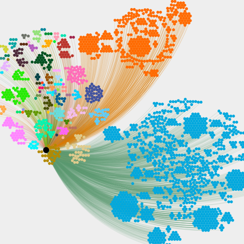
I’ve been doing some “First Defence” analysis of the Two Up firewall. I was trying to work out the best way to visualise the data. I started with Pie Charts, then Bar Graphs. Whilst this was good for representing the larger chunks of data (Country, mostly), standard 2-D graphing meant the smaller parts were inconveniently lost. For instance, when one country has thousands of hits, whereas ~20 countries have less than 10 hits, those smaller “hitters” are lost in the noise. If you just want to see what the pretty colours mean, there is a link to the viualisation at the bottom of the post (i.e. TL/DR!). It’s not very mobile friendly at this time. Sorry!
I’ve previously used Gephi and sigma.js to produce visual analysis of large datasets. These have been primarily for fun, research and learning. That learning has come in handy. Whilst the other visualisations I’ve produced in Gephi/Sigma have been “grouped”, There was always a fairly narrow grouping (affiliation, monetary amount, social media following.) This time, I had thousands of endpoints, and multiple groups.
Amongst the other slightly less useful data generated by a firewalling system, there are some core / common identifiers upon which analysis can take place. You have the “Host IP”, “Type” and “Date/Time”. From those, you can discern a lot of information – how often has a particular host attempted to access which service(s), and over what time period. This lets you analyse several things. Is this a persistent attack from a single host; Is a particular service being attacked more frequently. Most importantly, it lets you see whether a compromise may have occurred. If you see a lot of attempts at a particular service, then the attempt rate suddenly drops, there is a chance that the service may be compromised. The logs let you know where to look, and when you should be looking.
That only provides a part of the picture to you. An IP address can tell you many things that aren’t stored by firewall logs. You can, however, cross-reference the data with other public sources. You can determine the Country, Network Route and Internet Service Provider. You can even, sometimes, provide the name of the person who has been allocated that address range. From that, you can determine whether you are seeing a lot of attacks from a single computer, or a lot of computers in the same area. By looking at times of attacks, you can even work out with a fair degree of certainty whether a group of attacks are ultimately coming from a single source.
The visualisation I have created initially groups the attacking IP address by Source Country, then groups by Internet Service Provider and number of attempts (hits). I’ve put the final product up on the Two Up Playground alongside by other experimental projects. If you’d rather just see the firewall visualisation, you can use this direct link to go straight there.
0 Comments Leave a comment
Comments are closed.