Firewall Analysis

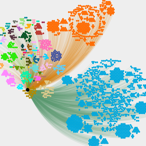
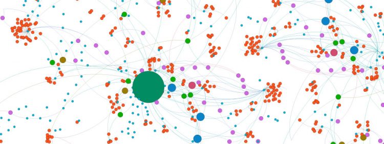
I’ve been doing some “First Defence” analysis of the Two Up firewall. I was trying to work out the best way to visualise the data. I started with Pie Charts, then Bar Graphs. Whilst this was good for representing the larger chunks of data (Country, mostly), standard 2-D graphing meant the smaller parts were inconveniently […]

Imagining in 3D

In my spare time, I like playing with maps. It is quite amazing just how much information you can portray in a simple image. You can reference volumes, places, differences – you can even create heat maps if you like. I’ve not moved any of my 2D maps over to the playground yet, but I […]

Social Graphing

I have recently revisited ways to visualise large, and complex data sets. As well as “traditional data”, I’ve ventured into “Social Graphing” too. This is the process of analysing data from Social Networks, and joining the dots to visualise links and interactions. This incredibly intricate data can be quickly assessed and categorised, highlighting areas of […]